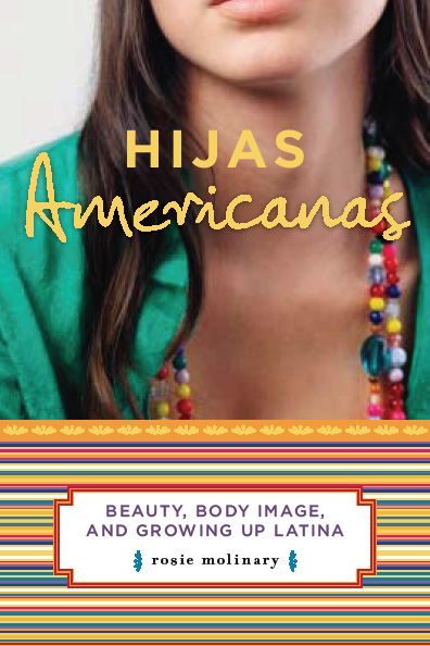
I just received an e-mail from a woman whose colleague gave her a copy of Hijas Americanas last week. Here is a question she had: I am dying to know about the cover– concerning the faceless Latina. Do tell or do I have to read the book to find out? So maybe others have wondered about the faceless Latina on the cover. If so, here is the story behind it. Sometime last year, my editor e-mailed me and asked what I wanted to see for the cover of Hijas Americanas. I didn’t know EXACTLY what I wanted to see, but I had a sense of the essence that I was going for when I wrote her back. Basically, I told her that I wanted the cover to be bright and vibrant or black, white, and sepia. The in-between spectrum was just not the right tone. Then, I asked that the cover either primarily be a photograph or someone’s art work—a painting of some kind. I knew for sure that a cover with graphic art just couldn’t represent the essence of the book. We gave the designer those parameters and some information about the book, and she had at it. A few weeks later, the first cover came to me for consideration (although it is important to note that while authors have input, they do not usually have final say in these matters), and I was torn. There on the “first draft” was the faceless girl on the top half of the cover and the bright stripes on the lower half, and I knew those things were just right. But there was something else on that first cover that was throwing me off. There, over the young woman’s chest, was the silhouette of the US. On top of the silhouette was the title. The subtitle was in the stripes part like it remains today. I contacted a few of the women who had been interviewed for the book and got their reaction. And they agreed with my reservations. Visually, the map was too much, making the cover more cluttered. But the implications or tone of it were also off. Having sorted through those things, I let my editor know what I loved and what I had hesitations about with the cover, and draft two is the final you see today. And, to be honest, I LOVE the cover. It is beyond my wildest dreams. love that the faceless Latina implies an embrace of the faces of all Latinas; there isn’t just one look to a Latina or an Hija Americana. That, in fact, there is no right way to look as a Latina. Instead, there is an essence to Latinidad, a brightness, lightness and truth that was hopefully conveyed with the essence of the woman on the cover. This was one of the celebrations I had for the book cover when I talked to my editor about that first draft. That said, the book does address coming of age issues, and so it was appropriate, I think, to capture a young woman in the cover as it is an earnest representation of the time frame that is captured in the text. I hope that the people who pick up the book sense that air of possibility in her as that is what I see when I look at it. The photo was actually a stock photo, meaning one available for purchase, and it was of the entire face. The designer found it, thought it might be the one that could work and went from there with the bright stripes, the inset of the subtitle in the stripes, and the bright yellow title. Now, there are some coincidences to the cover that made me know that it was meant to be the cover because everything was so serendipitous. Even those who know me well have commented on these things. First, the color scheme is quintessentially me. That teal on the side of the book is my absolute favorite color in the world and has been since I was 15. I stole a shirt from my brother when I was 15 because it was that color, and I have coveted that hue since then. However that hue has not been readily available in the fashion world until this past year (so I am collecting pieces in the shade that I can covet for another 18 years like the shirt I stole form my brother), and I haven’t really seen it in the art world. And then, boom, it’s on my cover from day one. The other thing is that I love bright stripes. My personal stationary last year had bright stripes across the top like the cover, and my friends who saw the mock-up of the cover said, “Isn’t that your stationary?” How wild is that? Finally, the font used on the cover is so similar to the font that I use in my writing and to how I write. As a writer, you are in front of a computer screen so often that you want to find something that visually appeals to you as a font (or I do) as it is a way to express your style. But you turn your piece in good old Times New Roman and, yet, this designer just nailed the font selection. Both the script and the block letters are exactly right! I couldn’t believe it when I saw it, and had a great laugh when one of my former students wrote and said, “You obviously picked the font. It is so you.” So that’s the story behind the cover. Now, tell me, what did you first think when you saw the cover of Hijas?

